Dashboard User Guide: Helpful Tips and Tricks
- Before entering the dashboard, a splash screen is displayed with disclaimer information. To enter the dashboard, you must accept the terms and conditions.
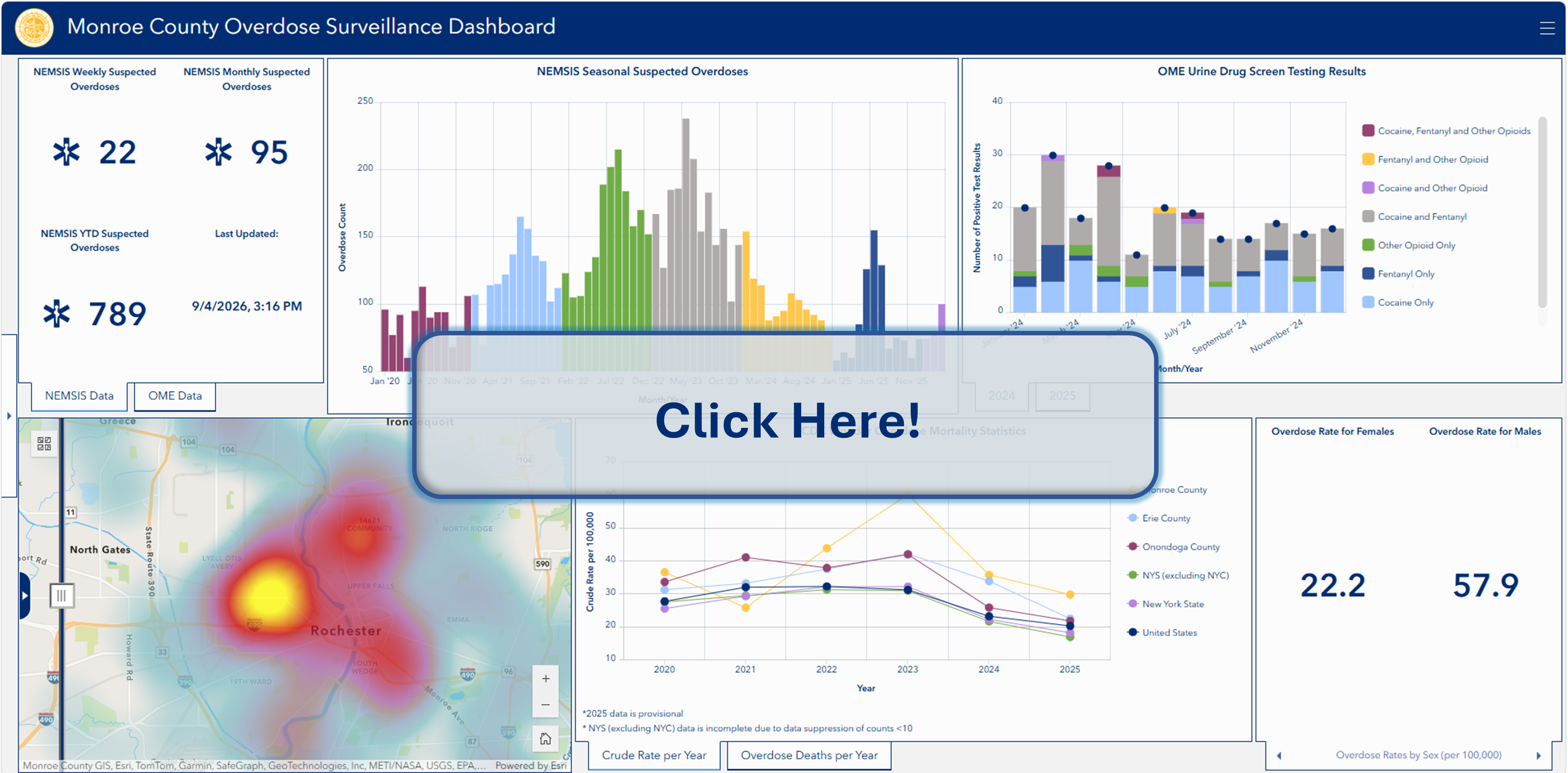
- On the left-hand side there is a side bar, which displays important information including: data sources, dashboard elements, additional information, and contact information.
- For all of the panels, a four-way arrow icon appears when the top right corner is hovered over. This can be selected for full-screen viewing.
- Regarding the heat maps in the bottom left-hand corner, layers can be turned on and off.
- For instance, if 2024 suspected overdoses is made a leading layer and 2025 suspected overdoses is made a trailing layer – the swipe bar can be used to see differences between the two maps.
- In the top right-hand corner, there is a menu button with some additional information. The drop-down menu provides useful links relevant to the context of the dashboard.
The top left and top middle panels are updated on a weekly basis. The other panels are updated on a yearly basis, as new data becomes available.
For questions regarding the dashboard, please email the Epidemiology and Disease Control Division of the Monroe County Department of Public Health.